It may be too soon to declare the desktop dead, but for marketers it may as well be.
If you are still building digital marketing creative primarily for desktop, you’re likely either irritating your customers or failing to reach them entirely.
There is one caveat: if you are a B2B company and you are primarily selling to people during the hours of 8 a.m. and 5 p.m., Monday-Friday, your customers might be on desktop. Indeed, it is probably because so many of us use desktops and laptops at work that we fail to comprehend how significant the shift to mobile has become.
Mobile is now the default experience.
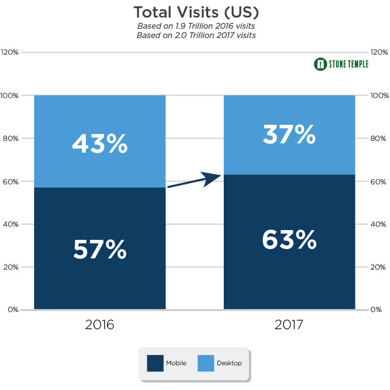
63% of all website visits were from mobile devices.
Consider these stats from last year: 63% of all website visits were from mobile devices (nearly two thirds), up from 57% the prior year, and total time spent on websites via mobile increased from 40% to 49%. It is true that on several engagement metrics mobile still underperforms, but this is more likely due to poorly designed mobile experiences and the touch-and-go nature of mobile, rather than mass disinterest from users. The story is clear: smartphones have become the standard vehicle of communication.
Mobile isn’t only a device. It’s a location.
It is no surprise, then, that we are also seeing more sophisticated developments in location-based targeting—allowing for more relevant, in-the-moment messaging. Imagine you recently browsed a pair of shoes online, then, as you walk past a particular shoe store, you get a notification that the sneakers you were eyeballing are now 20% off inside. While we aren’t quite at that level of detail, we also aren’t far off. This technology opens interesting new doors for combining out-of-home advertising and events with location-based ads to capture impulse actions.
It’s time to rethink your creative process.
A mobile-centric approach isn’t just about making sure your website is mobile-friendly. It requires a whole new way of thinking about how, when, and where people are accessing your content. If your pitch is longer than a tweet, you might need to tighten it up. If your video is horizontal, consider whether vertical makes more sense.
we can no longer afford to let the legacy of the desktop era dictate our creative process in the mobile era.
Even at Polymath, this sea change has been a challenge to navigate. Like many agencies, we are accustomed to designing websites with a beautiful wide layout first, and clients are much more likely to grasp that vision. Then, it is left to the developer to figure out how to make it work on mobile. But, we can no longer afford to let the legacy of the desktop era dictate our creative process in the mobile era. We have to design amazing experiences in a vertical hand-held screen, delivered on a device that has a unique set of built-in technologies, and used by people who are on-the-go.
Take a minute to consider how our new digital lifestyles affect how we engage with content, email, social, and ads. Every aspect of communication must be re-examined and refined to fit how our customers actually go about their day, because that’s meeting them where they are. And staying relevant and accessible in the crowded online marketplace is more important than ever.