What’s riding on a good logo? A lot, if you’re running for president.
Most voters never get the chance to meet the candidates face to face. But, they do get to interact with campaign branding through a variety of ever-evolving platforms: TV, social media, and direct mail, to name a few.
When executed well, a presidential campaign logo can be an accessible shorthand for the candidate’s message, story, and ideals. At worst, it can reflect the haphazard, often incoherent thinking that drives much of today’s politics. Get it right, and you prepare a positive first impression. Get it wrong, and you risk sending an implicit signal to the voting public: this candidate’s not for me.
“The highest order of logo design is not whether it is memorable but whether it is authentic.”
Enter Evan McMullin.
A late entry into the 2016 race, McMullin offered himself to voters as a better way, a conscientious choice for those disaffected by the major parties’ nominees. To date, he has exceeded all expectations. As of press time, McMullin is on track to become the first independent, third-party candidate to win any U.S. state since 1968. In very short order, the McMullin campaign has become a symbol of next-generation American leadership.
Before his announcement, the McMullin campaign approached Polymath about creating a visual identity for this new, bold venture. I recently sat down with our director of graphic design, Jeff Trojek, for a conversation about how our team crafted a logo that’s now been seen by tens of millions of American voters and many more people around the world through the Internet.
CE: Once in a blue moon, a presidential campaign logo breaks through and becomes iconic (Obama 2008). On occasion, a presidential campaign logo becomes a national embarrassment (Trump-Pence 2016, 1st edition). Usually, though, they’re just forgotten. How do you go about designing a campaign logo that will be memorable?
JT: It’s not easy. But, I’d actually reframe your question a bit to say that, in my opinion, the highest order of logo design is not whether it is memorable but whether it is authentic. Of course, you want it to leave a lasting impression, but that impression does you no good if the impression is not true to the candidate’s or organization’s brand. In this case, we had a remarkably blank slate to work with. What I mean is, Evan McMullin, as a public figure, was largely unknown before entering the race. So, we had a lot of directions we could go with the branding.
“As they say, ‘People don’t vote for logos. They vote for candidates.’”
CE: We did have some initial contours provided to us by the campaign. They wanted the visual identity to reflect Evan’s unique position among the major candidates: he’s youthful, energetic, and forward-looking, all while still relatively conservative in his politics—basically, he’s the opposite of both Donald Trump and Hillary Clinton. He has an amazing resume, too, which gave us many sources of inspiration: CIA operative, congressional policy director, missionary…
JT: Yeah, for a young guy, he’s done a lot of cool stuff. I remember you and others on our team emphasizing how we didn’t want to lose that “freshness” in what we put together. We were able to incorporate all of that into our thinking about the logo, starting with a brainstorm of associated words and themes that captured the essence of the campaign.
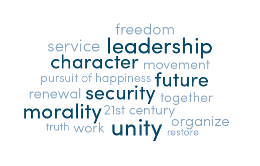
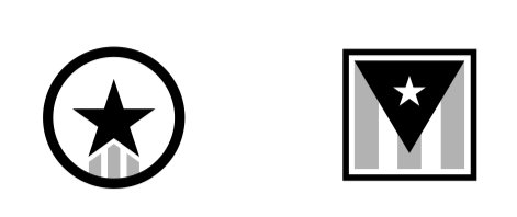
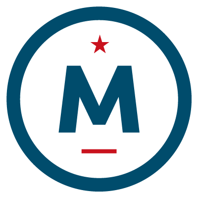
JT: Of these themes, our initial conversations with the campaign led us to focus on imagery that conveyed ideals like unity, security, equality, and morality, in particular. Given the divisiveness of the 2016 campaign (racial tensions, party divisions, record disapproval of the major-party nominees), we felt Evan had an opportunity to stand out graphically and to represent a different tone and style from the other candidates. One of the campaign’s early taglines was, “America deserves better.” So, we focused on at first on icons with patriotic overtones—a circular option that evoked a service medal, as well as a flag-inspired cube that had some visual substance to it.
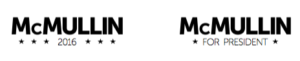
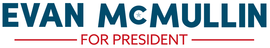
CE: The accompanying wordmark was tricky, too… Reality was, not many people knew who this guy is or what is name is. We debated internally about whether or not to include his first name or just to go with a last-name only mark, as has been traditional. Ultimately, we went for the full-name approach but didn’t start out there.
 |
 |
 |
 |
Initial concepts for the campaign wordmark
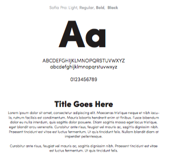
JT: We knew, as well, that a good logo doesn’t live on its own. It’s part of a larger system that includes fonts, color palette, and imagery. Thankfully, we settled pretty early on those choices. Working with the outstanding team at Hines Digital, we selected a bold and nimble sans-serif (Sofia Pro) and paired that with a rich, fresh, yet still somewhat-conservative, color palette.
 |
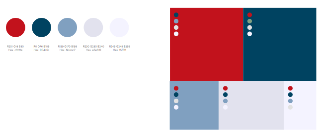 |
Font selection and color palette for the campaign’s visual identity
CE: What were you thinking about as we went back and forth with the campaign through various iterations?
JT: We already talked about the importance of authenticity, but as we began to hone in on a design direction, I started to focus more and more on applicability. Whatever logo, icon, or wordmark we came up with had to be usable in a lot of different scenarios and at a lot of different sizes. You need an identity that works on a lapel pin and on a yard sign, on the website and as a profile pic. So, we had to keep all of those in mind throughout the design process.
CE: We ended up taking a few more detours on the road to the final logo… The initial icon drafts were very stereotypically American, but they didn’t feel particularly unique to the candidate. There’s a lot you can do with the letter “M,” we realized, and so we played around with a few concepts to build on those previously letter-less icons. I remember we had some more curvy and wavy alternatives at one point—more literal plays off of a waving flag.

JT: Those came across a bit soft, though. Evan was a serious candidate with serious chops, and we wanted the logo to reflect that. So, while the initial icons felt a bit too militaristic, we heard from the campaign that they liked the geometric feel of that first set. Something modern but with classical tastes…something that could appeal to millennials and traditional conservatives alike. That’s when we started taking a more minimalist route.
CE: And we had the breakthrough about using both names in the wordmark, because we needed to raise his full-name ID.
JT: Yes. It took us a couple more takes—experimenting with the number of lines and stars—to get to the final, but ultimately we settled on the circular icon to convey this idea of American unity (that the nation needs a leader that will bring people back together again), a star and bar to evoke the flag, and a combination of these elements in bold strokes to symbolize service and valor, traits Evan has exemplified throughout his life in government, humanitarian work, and business.
CE: We went live on August 8 with an online letter from the candidate to the American people, and things have really taken off since then. I, for one, can’t seem to open my Twitter feed without seeing the “M” icon in the corner of someone’s profile pic.
JT: Funny enough, Evan even got asked about the logo in one of his first interviews as a declared candidate. For the record, Mark Halperin, the logo is blue, not green (fix your screen!).
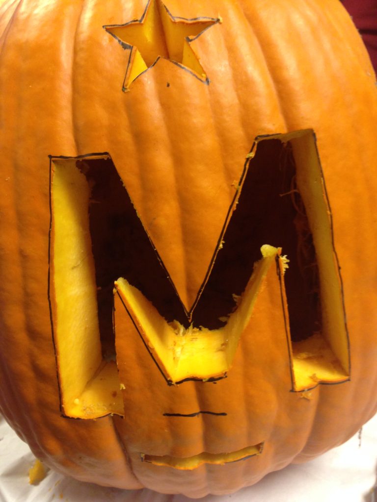
CE: Did you ever imagine that one day, you’d see one of your designs carved into a pumpkin?
JT: I can’t say I did, but, not gonna lie—that’s pretty awesome. I’m really proud of how this turned out. Even so, I’ll temper that enthusiasm by saying: great logos are fun to design and fun to display, but they can only do so much to influence perception about a candidate or an organization. As they say, “People don’t vote for logos. They vote for candidates.” I’m Canadian, anyway, so, at least in this presidential election, I won’t have to compromise my design values for anyone.