Great brands deservE great websiteS
SERVICES
Web
Web Design
Web Development
Web Apps
Landing Pages
E-commerce Stores
Your online platforms are your front door, your first impression… How do you make them work for your audiences and, just as importantly, for your team?
View project

the tags are being pulled through code and aren't visible in the designer
Baylor University
View Project
SERVICES
01
02
03
04
05
06
/
06
Case Studies
View project
the tags are being pulled through code and aren't visible in the designer
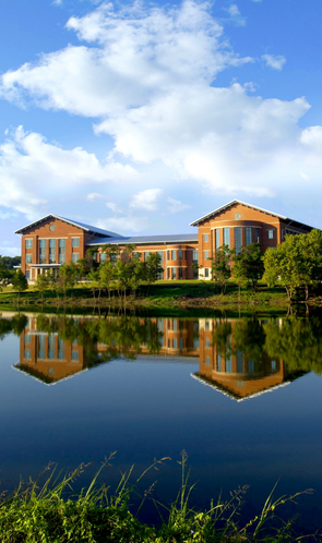
Georgia FLEX
View Project
View project
the tags are being pulled through code and aren't visible in the designer
Covenant College
View Project
American Enterprise Institute

Barna

Baylor University
Biola University
Care Net
Comment Magazine
Dallas Theological Seminary

Fuller Seminary
Int'l. Justice Mission


John Templeton Foundation

The Trinity Forum
Thomas Nelson

“The website is amazing... This is the beginning of a new chapter for our [organization] and, perhaps, a new movement.”
Nonprofit founder
SERVICES
How Else Can We Support You?
Video

Branding
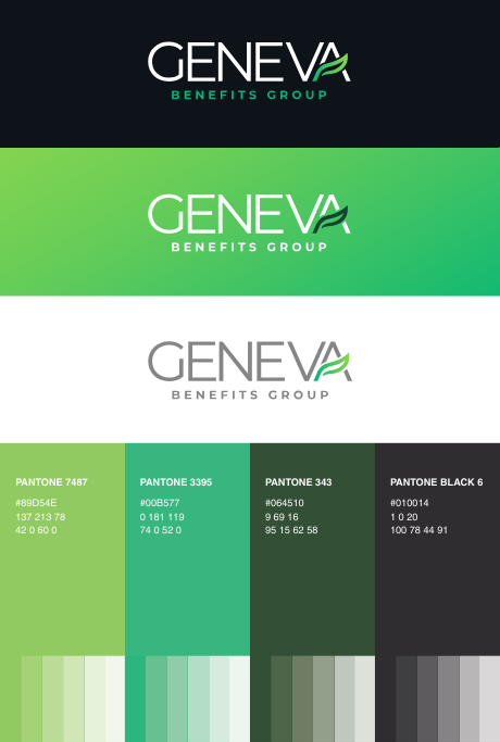
Marketing
Design